Brand Evolution
Our recently debuted corporate logo is inspired by and replicates our flagship brand logo—they share the same DNA. The red scallops and distinctive font are well-known, but took something recognizable and built on it to unify our history and our future.
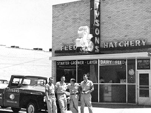
In the late 1930s, John W. Tyson establishes the foundation for one of the world's largest protein businesses: Tyson’s Feed & Hatchery.

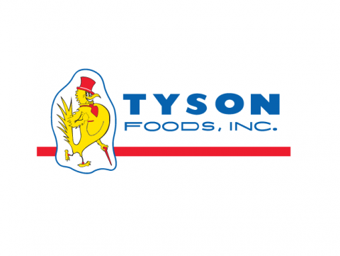
During the late 1950s and into the 1960s, Tyson products are marketed under the Tyson’s Pride® brand.

In the 1960s, Buddy Wray, former Tyson Foods President and COO designs the first oval logo.
In 1972, the company name changes to Tyson Foods, Inc. but the “Big Red” logo continues to be used for a time.
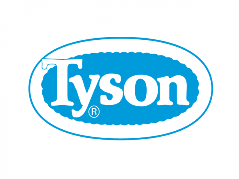
In 1972, the blue and white oval logo first appears in the Tyson Foods Annual Report.
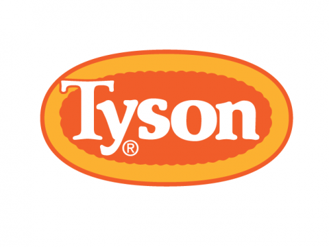
By 1973, a red outline is added around the blue and white oval logo. Between 1975 and 1978, the logo colors change to be more attractive in grocers’ display cases.

In 1995, the Tyson logo is redesigned to strengthen the company’s colors and make the image bolder.
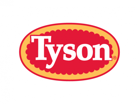
In 2005, the logo is updated and made more readable and easily recognized by consumers.
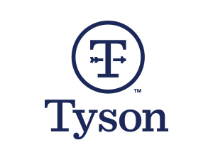
In 2017, our corporate logo ushered in a new, modern look. The weathervane spoke to the direction of Tyson Foods—always moving forward, focused on the future and raising expectations.